











Tabs at Top for "Templates" and "Lists"
We're planning to add some tabs at the top to manage/edit templates and lists in a full grid, but there would be some possible confusion having duplicate tabs at the top and right sidebar. The tabs on the right will be convenient to easily access and use templates and the tabs at the top would be more for editing in bulk.
Do you think this would be weird and too redundant? Maybe there should just be a button on the right sidebar templates & lists to open as full screen for editing in a grid? Any input welcome.
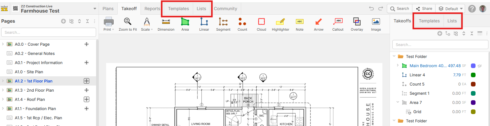
EDIT: maybe these are hidden by default, but users have the option to show them if they bulk edit templates & lists a lot?
%22%2F%3E%3Ctext%20x%3D%2232%22%20y%3D%2233%22%20text-anchor%3D%22middle%22%20dominant-baseline%3D%22central%22%20font-family%3D%22Arial%2C%20sans-serif%22%20font-size%3D%2226%22%20font-weight%3D%22600%22%20fill%3D%22%23fff%22%3EGG%3C%2Ftext%3E%3C%2Fsvg%3E "Gabriel Glenton")
That sounds like a welcoming addition. Having both options sounds good to me. Sometimes you want to go fullscreen with it, sometimes just have it on the side.
👍1
Looks like a good idea, definitely like the idea of hidden by default. With the ability of MCP, I really don't create templates manually any longer, just let Claude do it, but would be a cool option.
👍1