


Page Multiplier - Appearance
Do you feel this is a clear way to show page multipliers? Notice on the hover hint, you can see the value before multiplication as well as after.
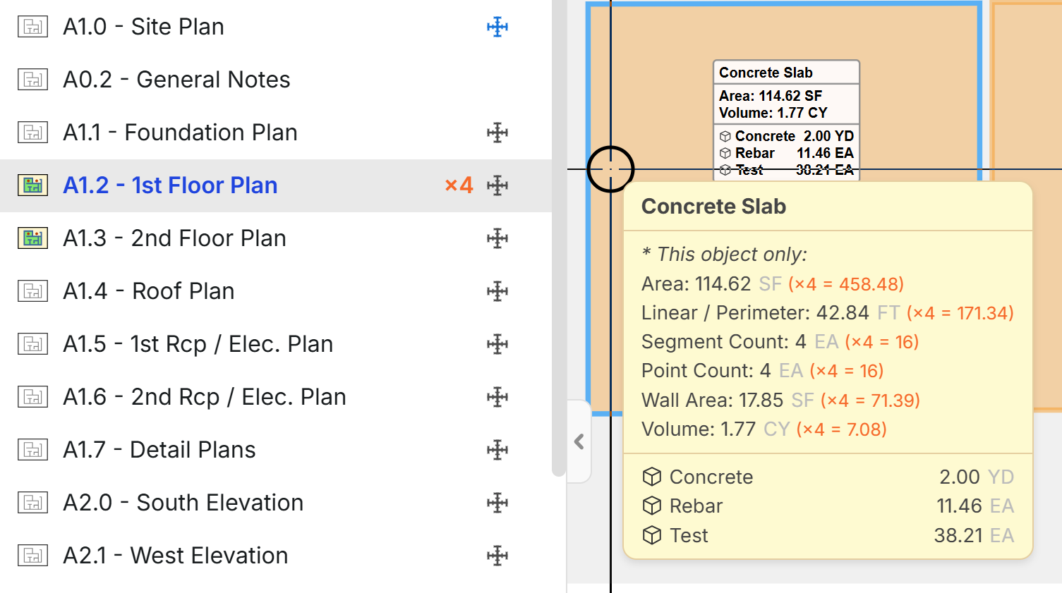
For the takeoff totals on the right, it would show the value after the page multiplier is applied.
Do you think the label (in white on the area behind the hover hint) should show before multiplier or after multiplier values?
There are lots of places in the UI where we would have to determine where to show before or after multiplier values.

I think the cleanest and least confusing approach is:
- Show the multiplied/final values everywhere by default
- Then show the original pre-multiplied value only in the hover tooltip/details
Reasoning:
- In estimating, people care most about the actual quantity being carried into reports, pricing, labour, and totals.
- If the drawing itself still shows the original non-multiplied values, users can easily think the multiplier hasn’t applied.
Red means Mario just died. Blue means power-up. The ×4 is a power-up.
Id keep it simple and happy with just that on the page on the left. Now that your are showing the calc in the yellow box that is kind of nice and clear tho…..just make it blue.
Drop the update and see what else people want. Love it!

I like where this is heading. My only suggestion is to keep the door open for future development. At some point it would be valuable to be able to define what each instance of the multiplier represents and be able to break them out and group them with other elements of the takeoff.

White box totals should show totals before the multiplier. No question about it in my mind. That white box should represent that area. An Account Manager/Project Manager coming in and looking at this and thinking that the displayed area is 4x the actual size is a disaster waiting to happen when adjustments are being made in real time in the field. I've seen this happen. Multipliers are something that I always encourage my estimators to be very careful with. In Planswift, I set up our templates so that the quantities in the takeoff summary would indicate any applied multipliers by displaying the multiplier in parentheses next to the quantity.

I think it looks great. Yes, the white box should show total, but I have to see that a multiplier was applied so I like how it looks above For reports, For reporting, I need one column showing the takeoff Qty, and another column for multiplier, and another column showing the total with the multiplier applied. Thank you!
How do i set this up? What you have posted above with the X4 in red is perfect.
@Dustin, thanks for the interest & feedback! This is currently under development, but we will let the community know as soon as it's in testing & released.
Do you have a prospective timeframe? Is there a similar workaround available?
What i've been doing for the moment is making sure my takeoff is complete. Highlighting, and copying everything on the page and pasting everything into the blank space outside of the drawing the amount of times i wish to multiply. I also create a note on page as a reminder.
Thanks, Luke. I used to do that back in the day; it is a dangerous way to do it. It works for a handful of mtuples but gets dicy when you are doing 20-30x. I'll just pull the data to Excel and multiply it there. Hopefully, this feature can be developed quickly.

@heber, love what you are showing above ... but also agree w/ Kyle's blue vs red comments.
Serve it up!