












1d 9h
Modernize the Toolbar
Under Review
Team, maybe I’m in the minority here, but these buttons are way too big and take up too much valuable screen space on top
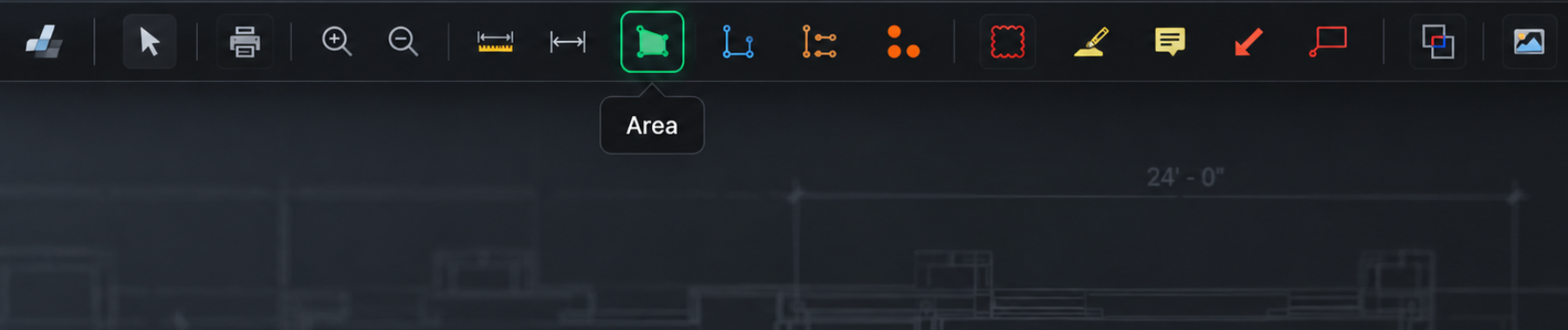
Now that we can add custom buttons, I think this is a good opportunity to modernize and consolidate the toolbar. We don’t need the text permanently shown under every icon. Keep the buttons smaller and cleaner, and show the tool name on hover.
Same functionality, just a much tighter and more modern interface. Here's my mockup that took three tries in ChatGPT to get to something that's decent.

%22%2F%3E%3Ctext%20x%3D%2232%22%20y%3D%2233%22%20text-anchor%3D%22middle%22%20dominant-baseline%3D%22central%22%20font-family%3D%22Arial%2C%20sans-serif%22%20font-size%3D%2226%22%20font-weight%3D%22600%22%20fill%3D%22%23fff%22%3EJ%3C%2Ftext%3E%3C%2Fsvg%3E "Jes")
Jes 9h 38m
Wow you can change the skin like that too? Is this even zzTakeoff anymore? 😅

Shawn M 8h 24m
the image Kyle made is a render. mine is a program I designed. at the moment, it lives outside of ZZ.
You must be logged in to post replies. If you don't have an account you can signup here.